


Tinkering with a national treasure
Working with Tuborg is a bit like being appointed custodian of The Little Mermaid. It may not be the world’s biggest or most flashy, but dammit it is ours. A national treasure. So we approached the job of creating a brand identity for the brewery with profound respect for what Tuborg is and what it can become.
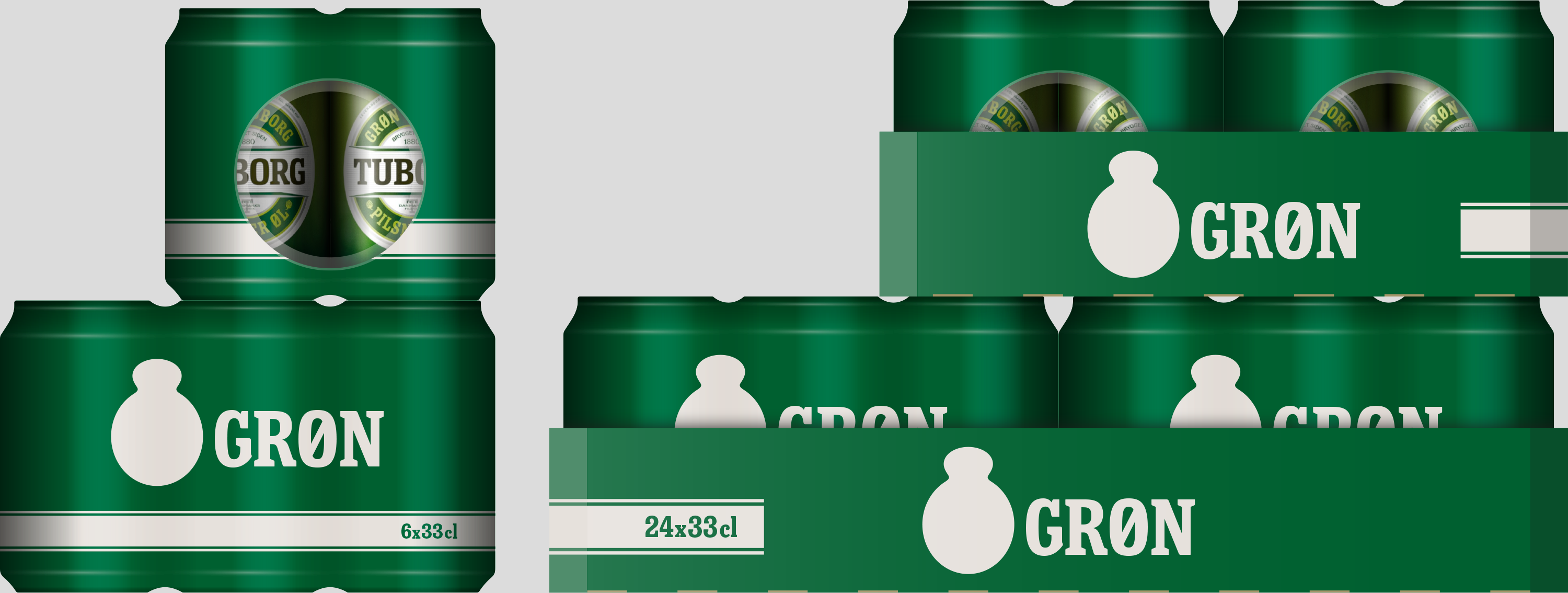
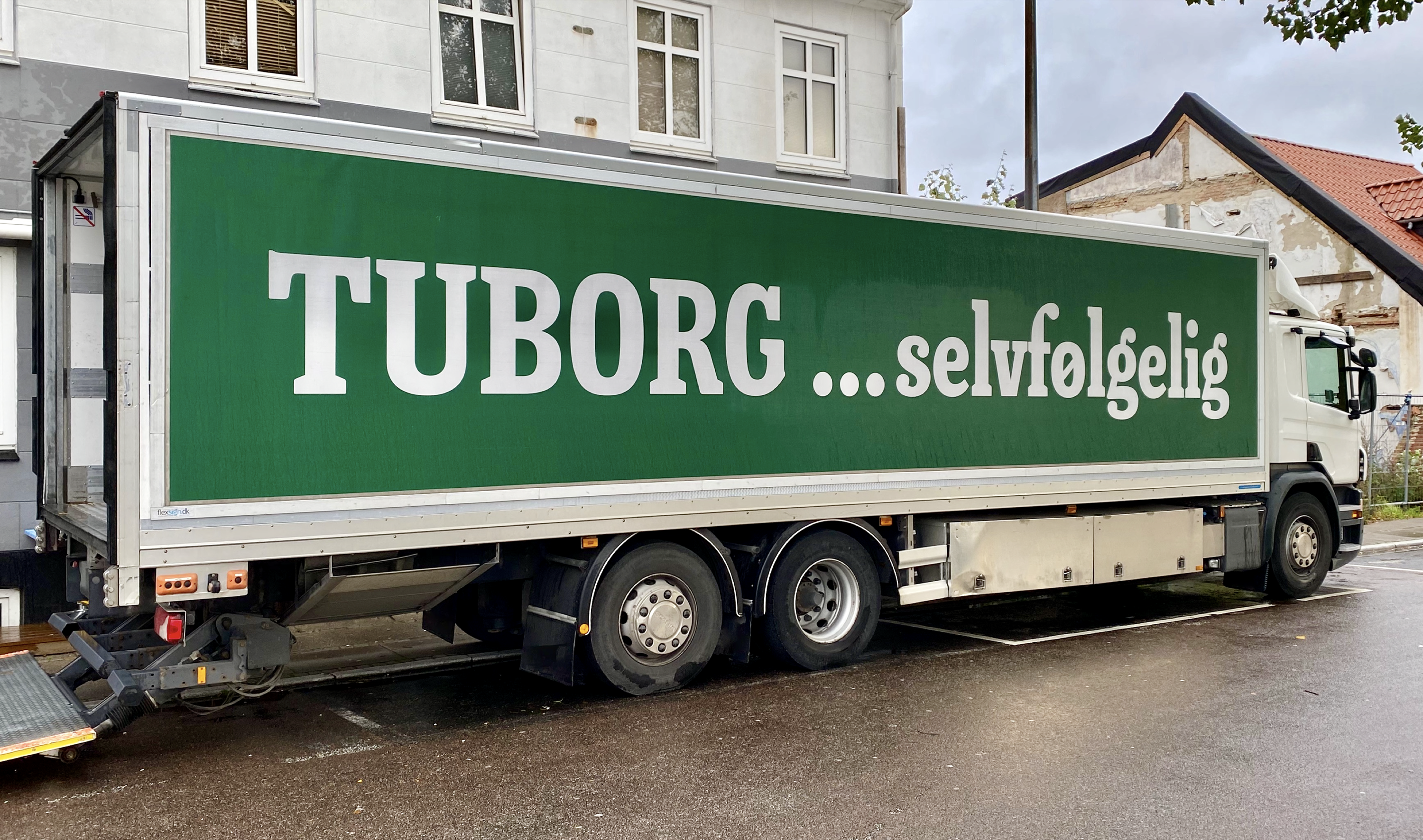
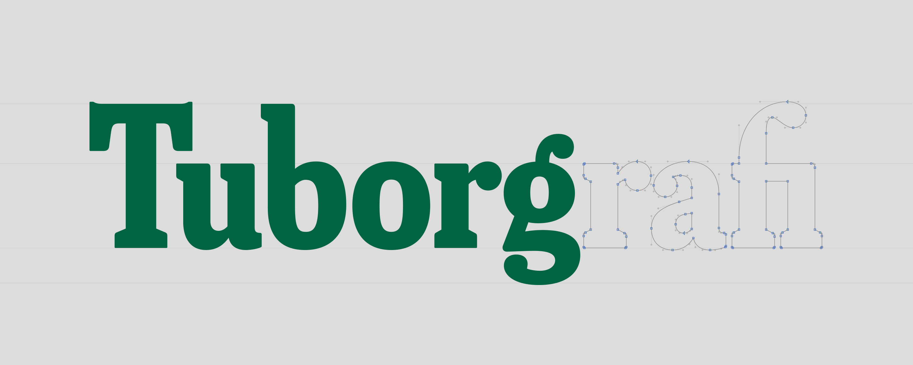
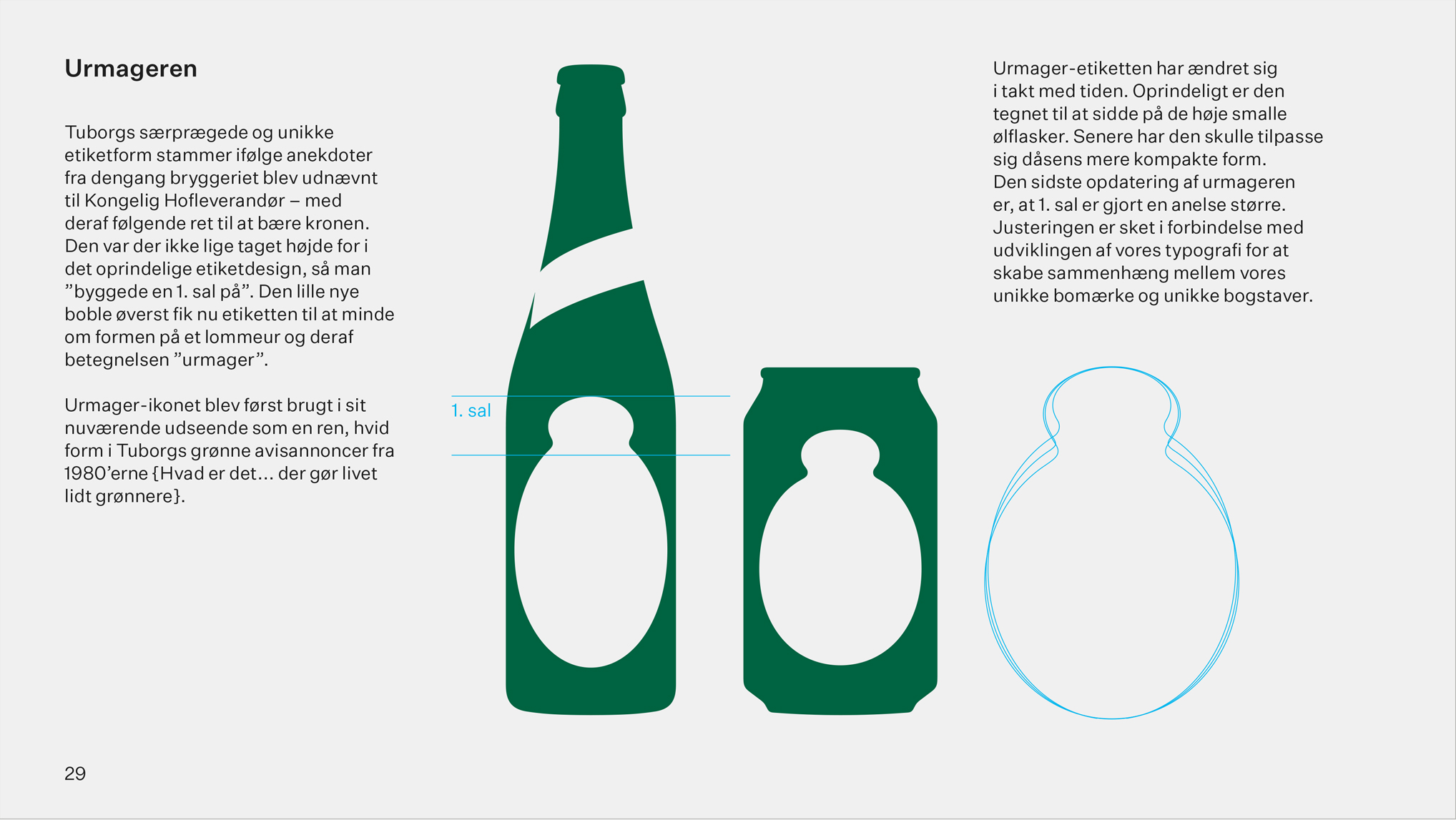
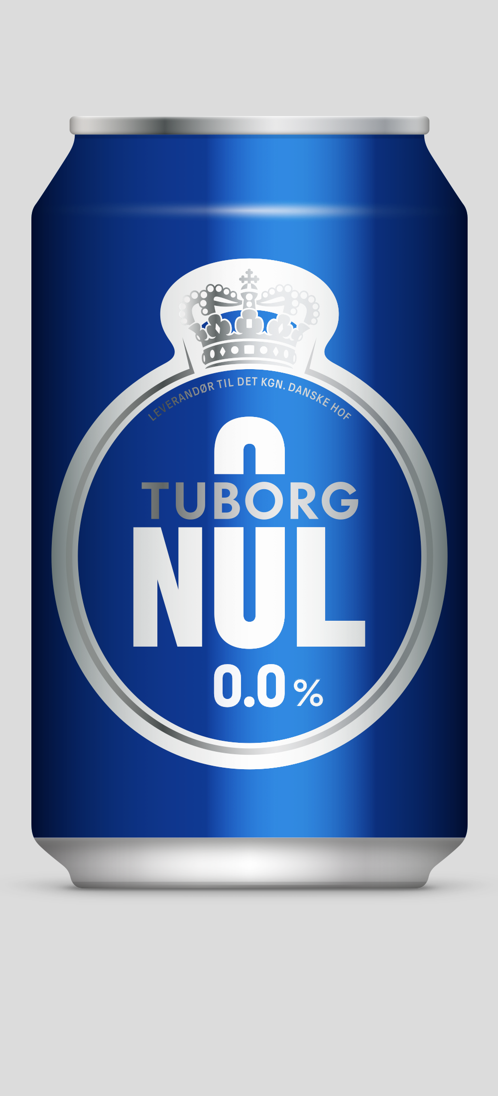
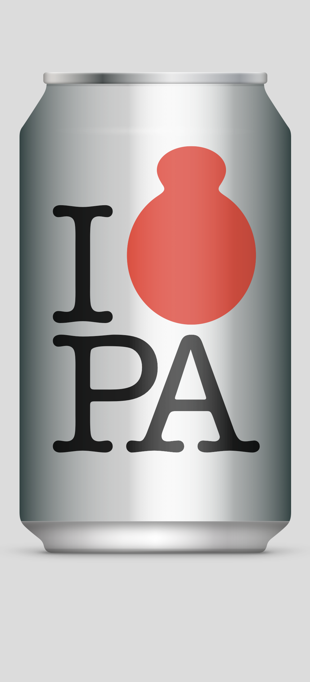
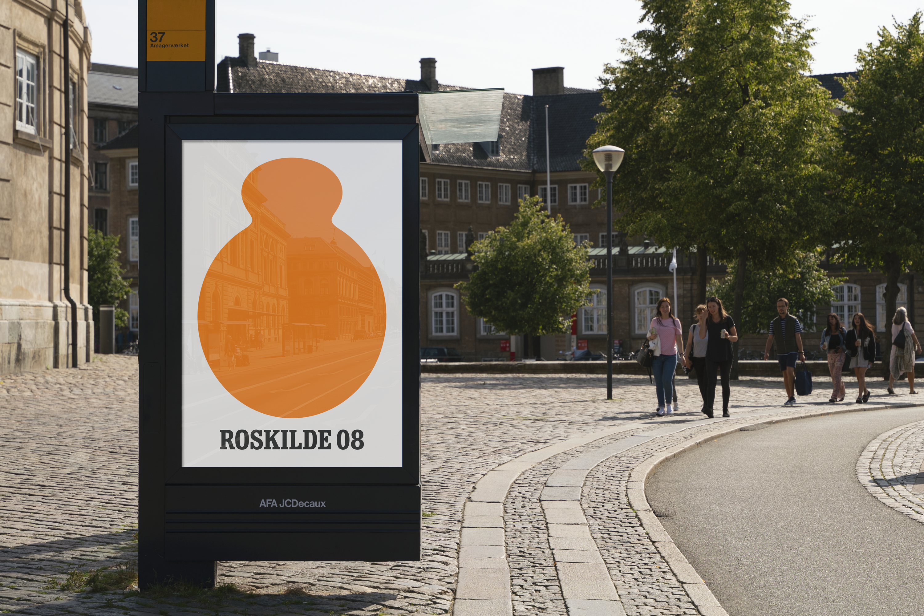
We created a consistent look across Tuborg’s portfolio, making sure that all brands pull in the same direction. The primary tools are Tuborg’s unique font and the iconic watchmaker label, named after its characteristic shape.
The packaging shown above was our take on how this would look in practice. Even if it wasn’t used, we still find it beautiful and on brand.
Done in collaboration with Henrik Juul.
Bespoke typeface done in collaboration with Jonas Hecksher.