
How to change an industry
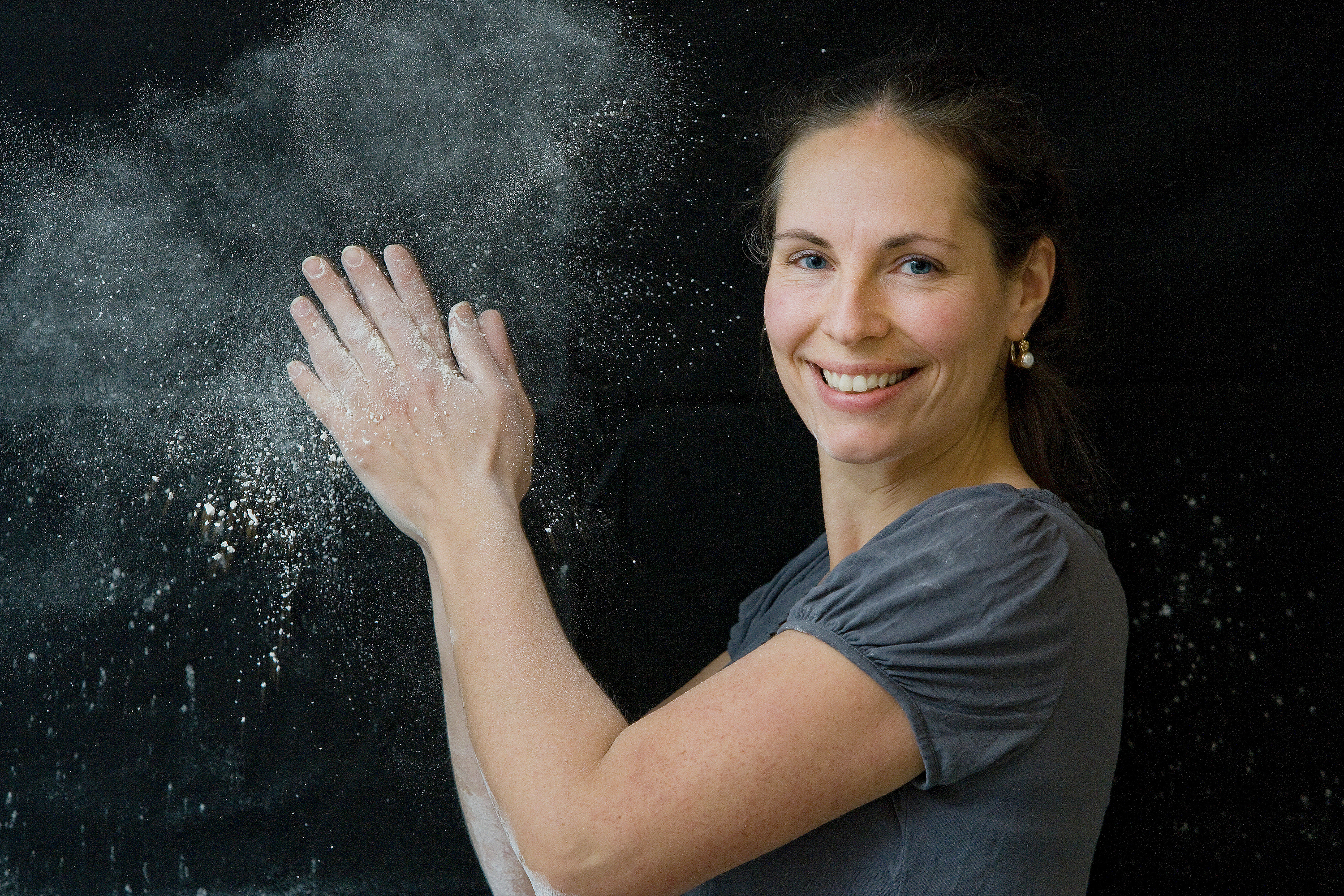
The good people behind this family-owned mill came to us before they even had a name. All they had was the ambition to make the world’s best flour.
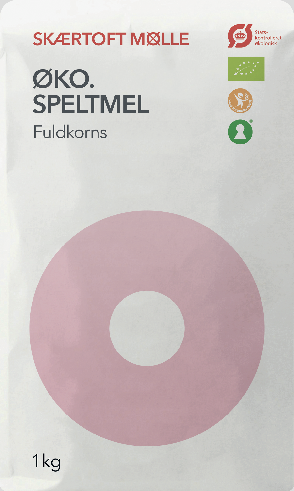
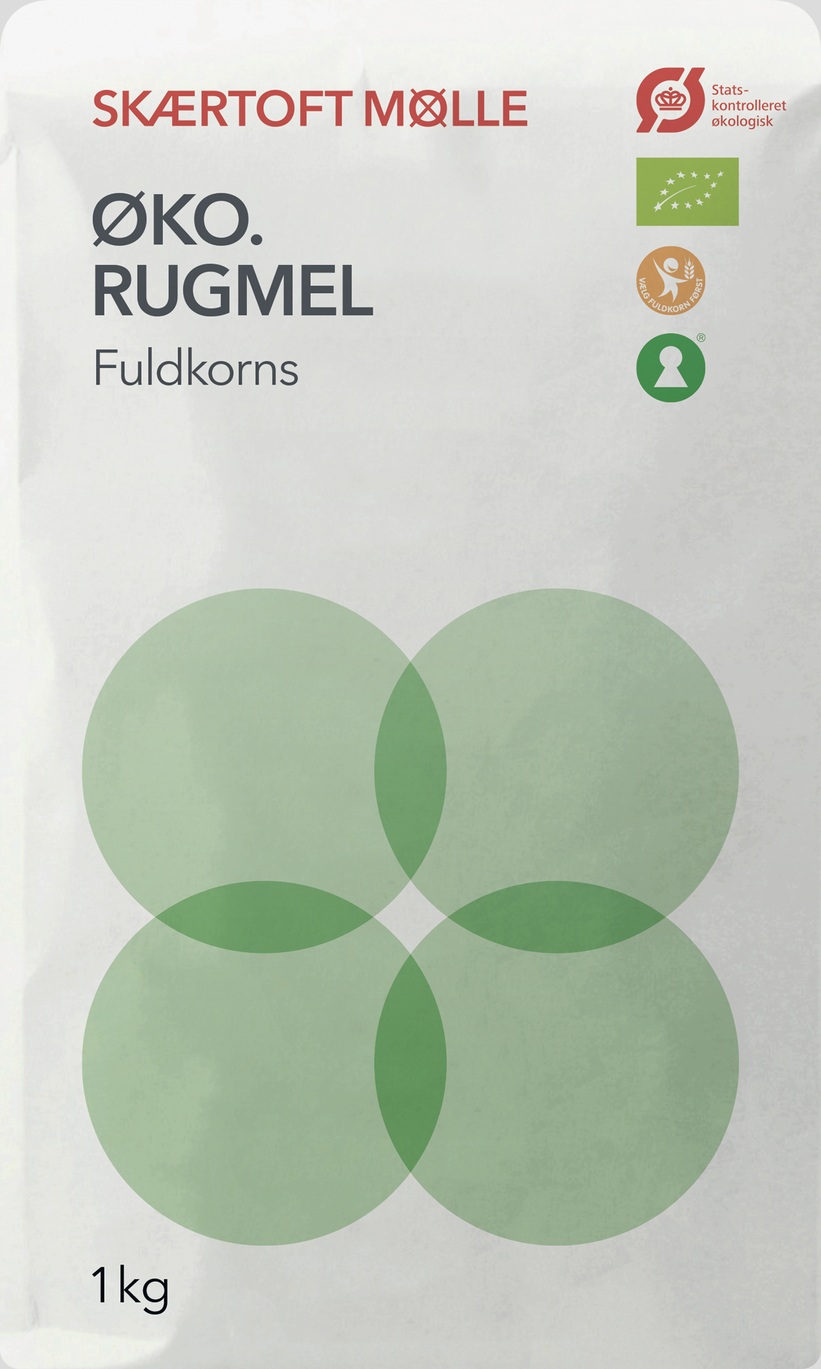
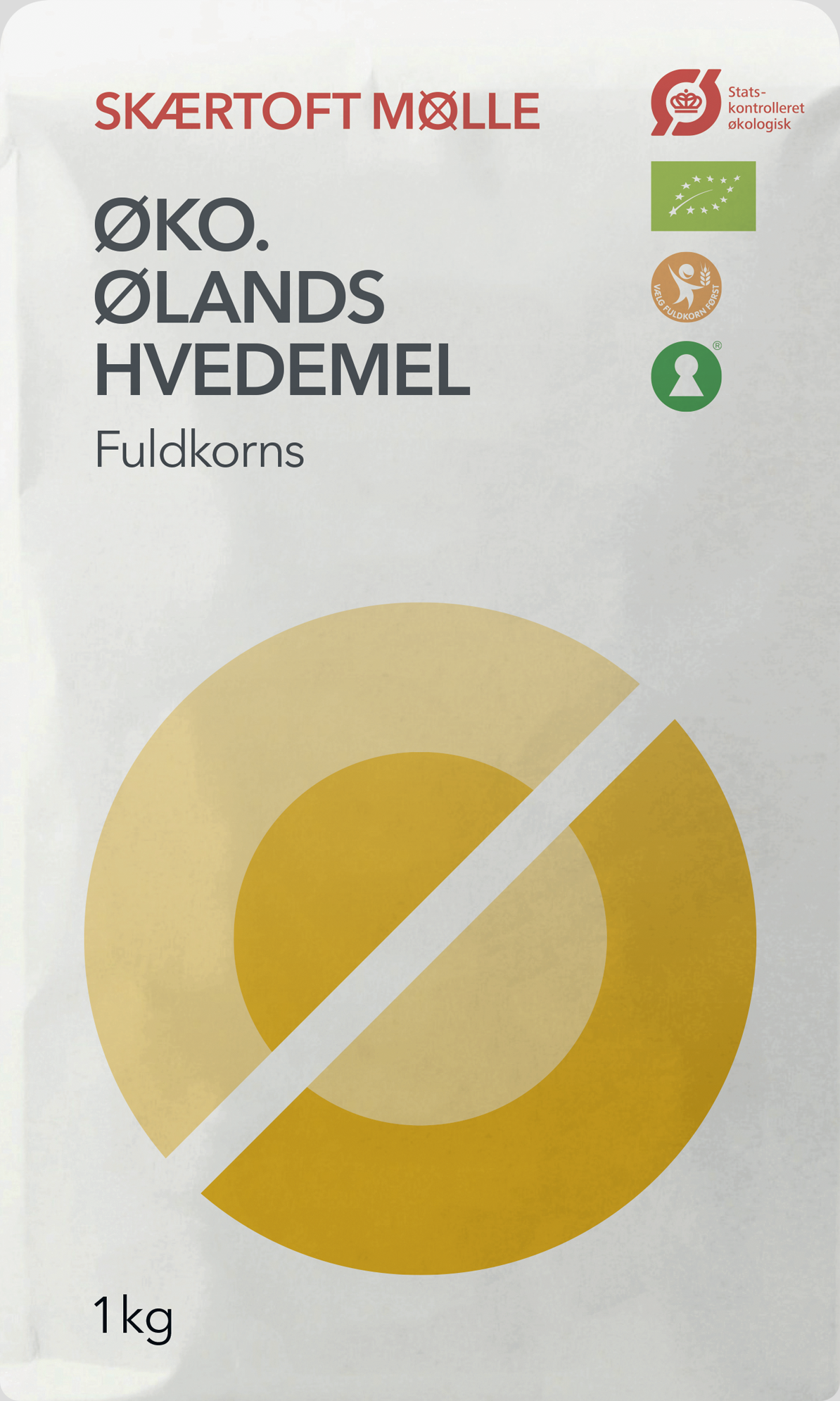
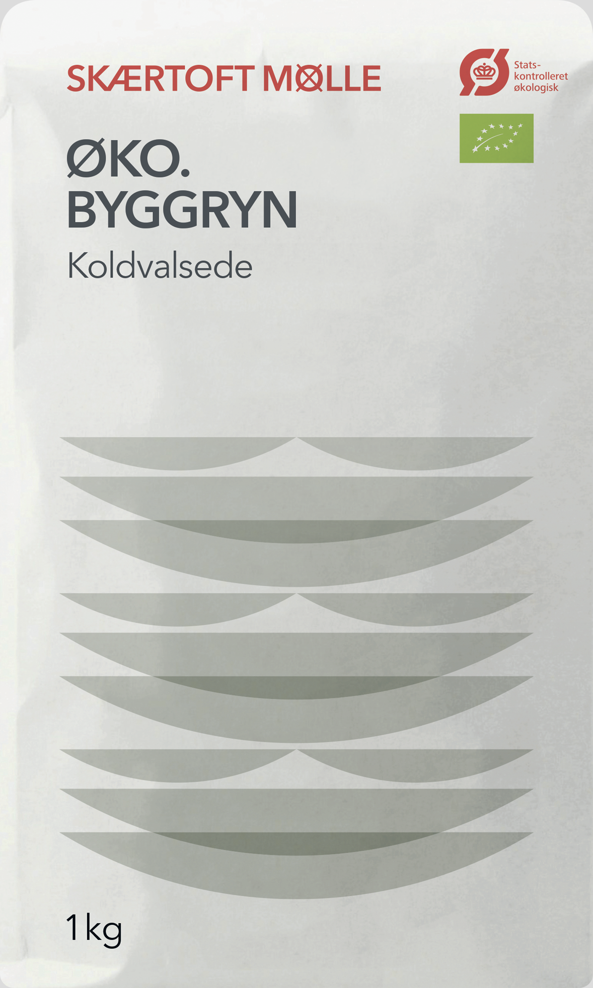
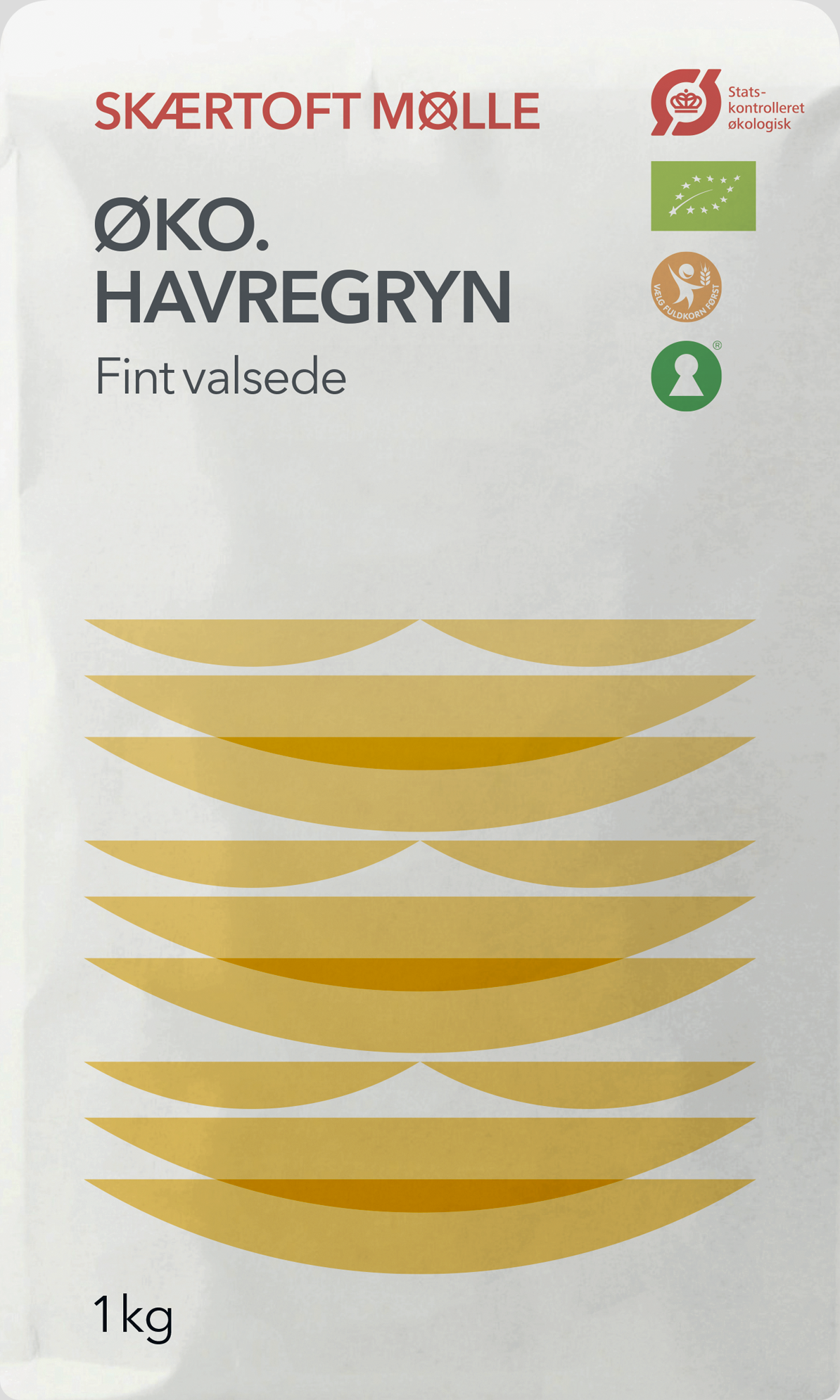
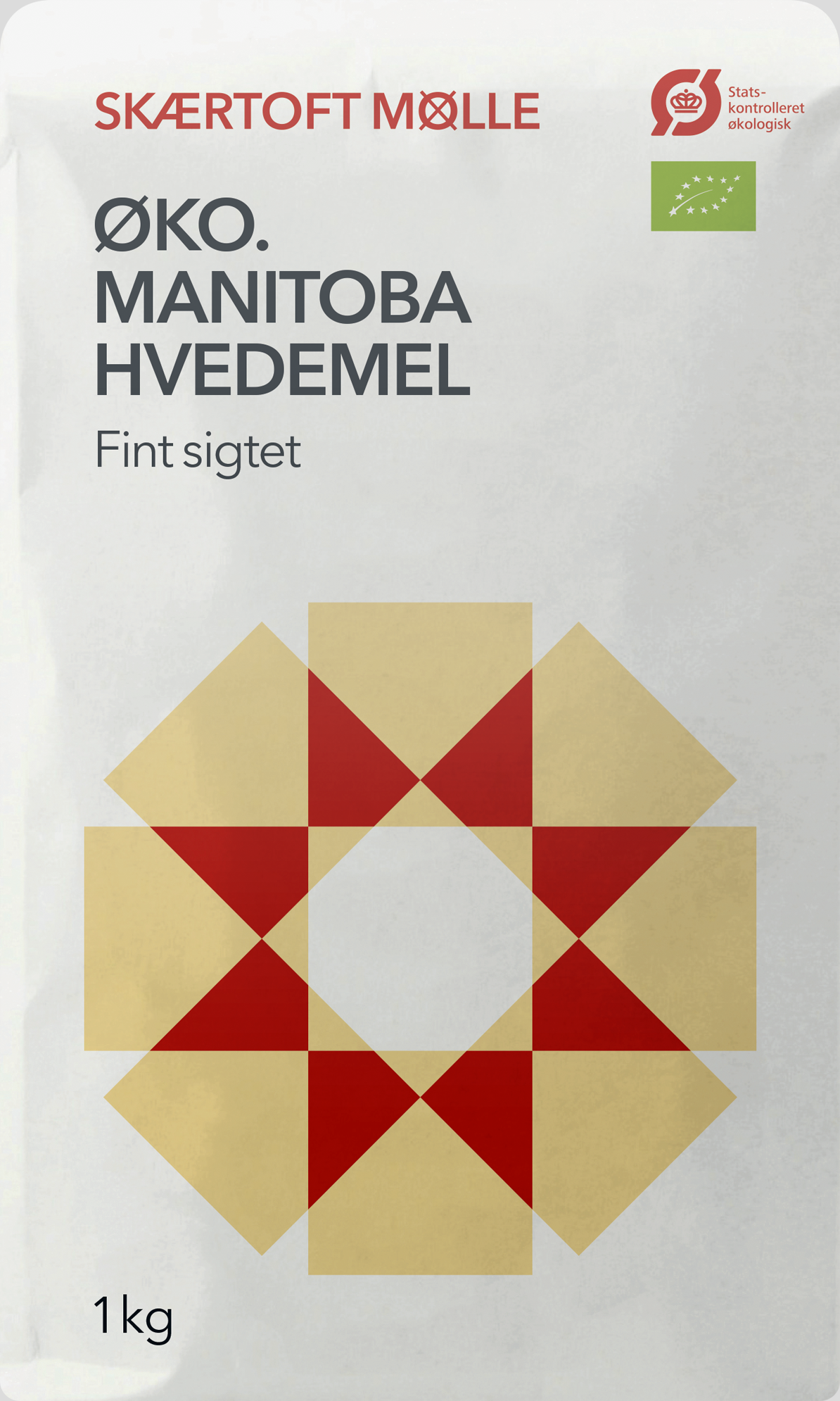
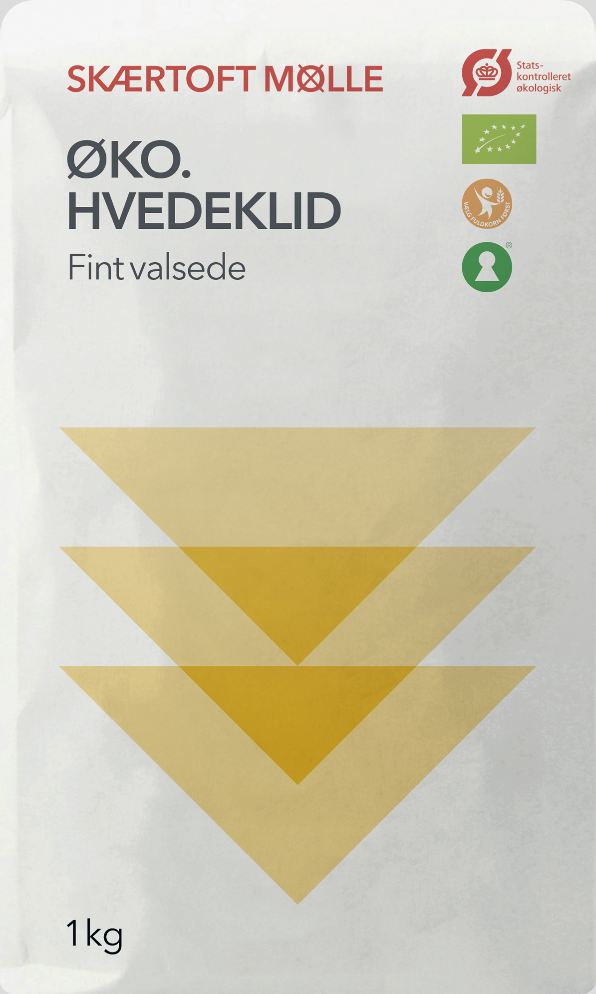
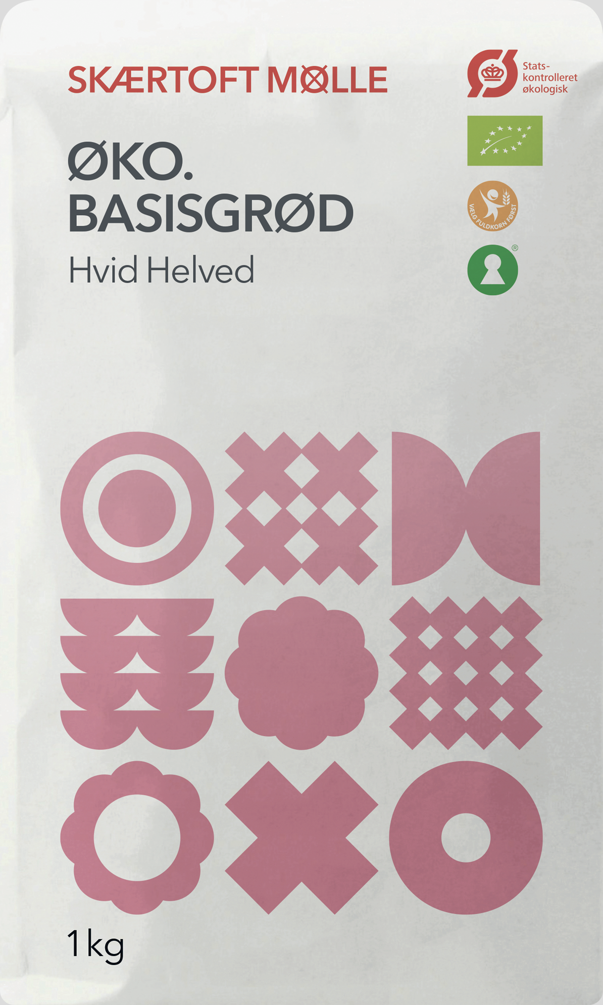
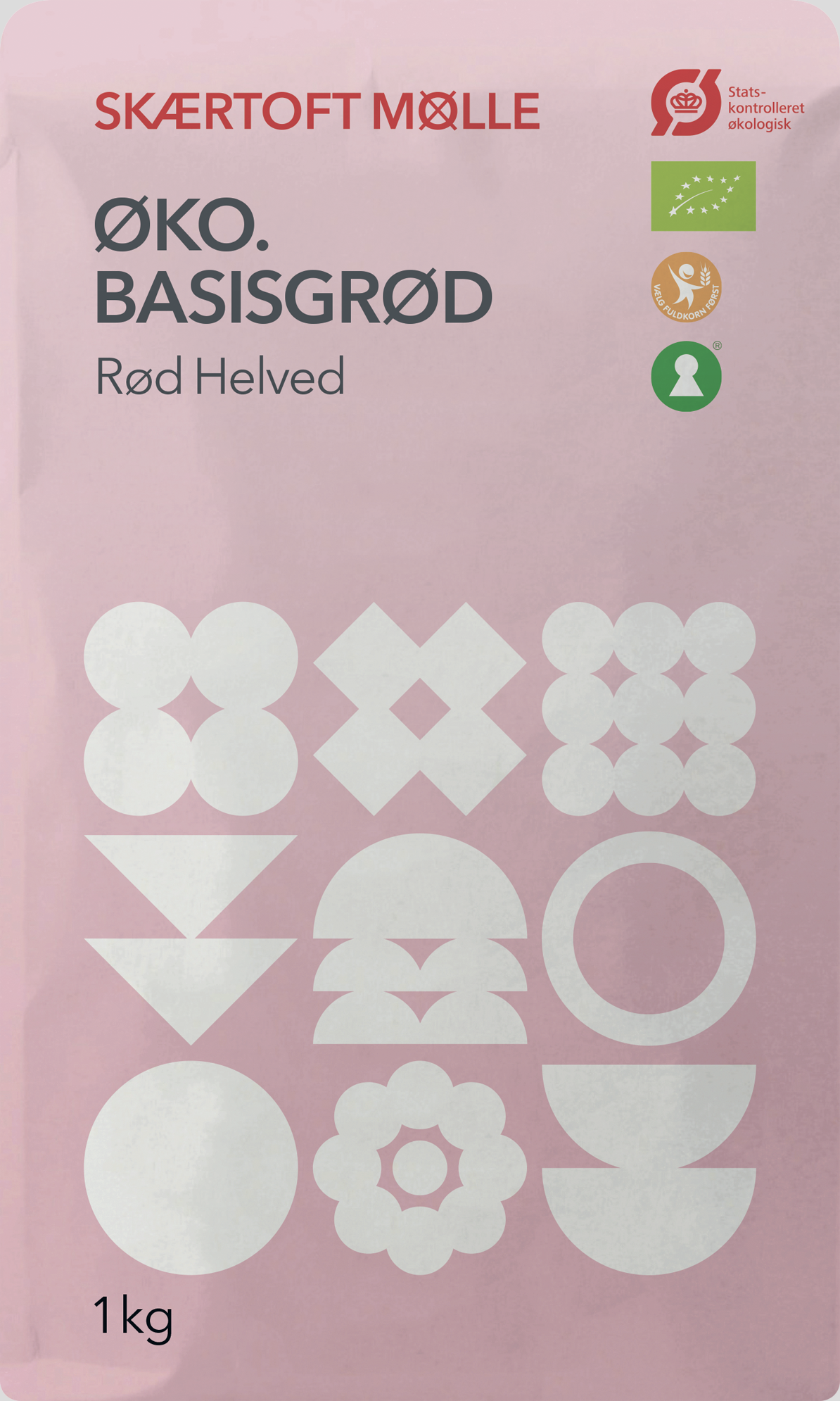
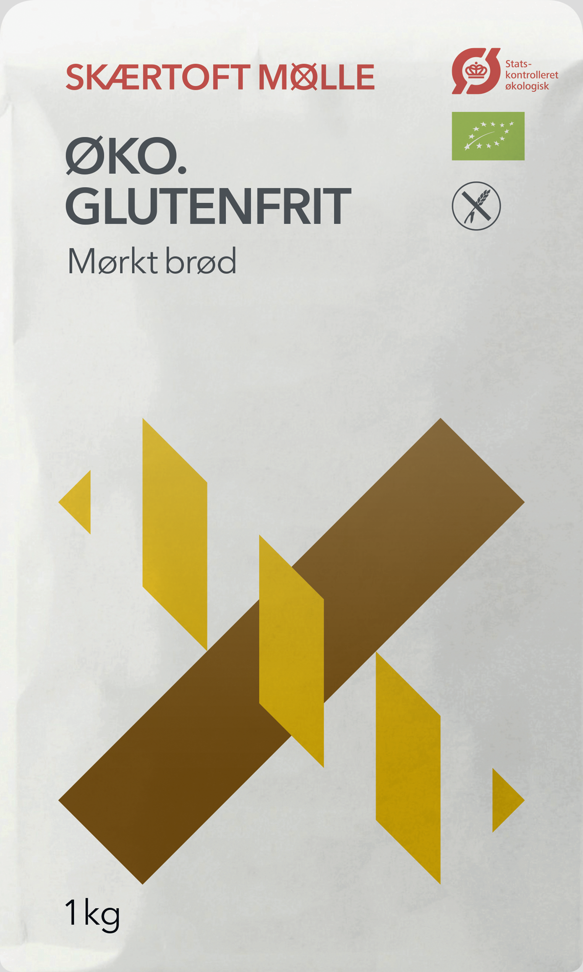
We got this assignment back in the days when every organic product came in brown cardboard packaging, preferably with a home-made woodcut slapped on the side. We decided it was time for a change.
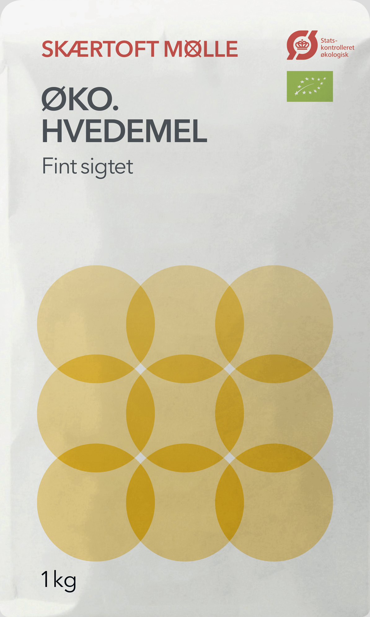
When the design first hit the shelves, it caused an uproar. Some said it looked more like detergent than flour, and supermarket execs feared that it was unsellable, but Skærtoft Mølle didn’t waver. And we’d like to think that history has proved them right. Over the years they have won multiple awards for their flour – and the packaging has won Den Danske Designpris and the honorary award Design Matters, given for design that drives business.
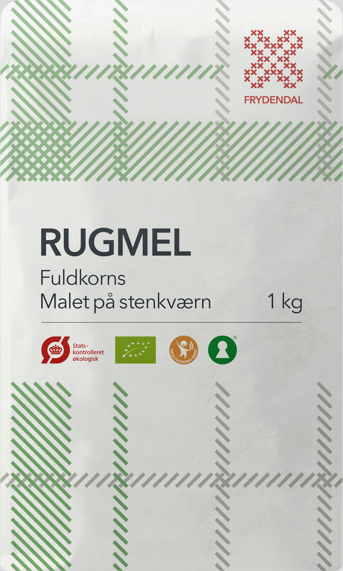
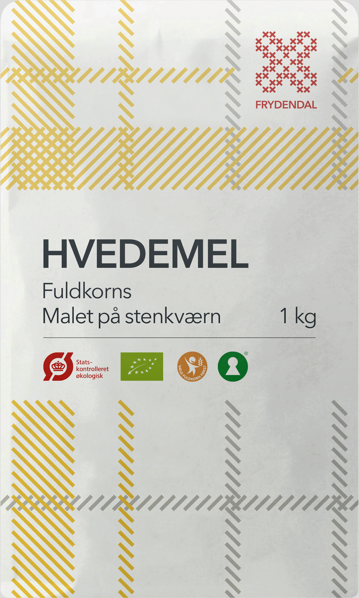
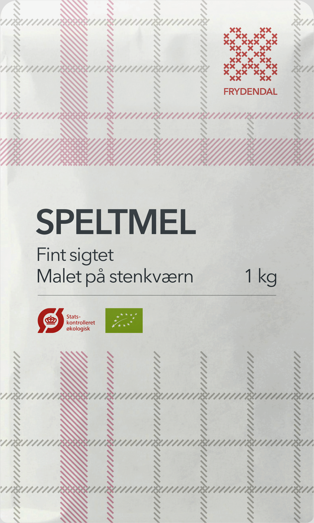
The design has been updated a few times since its inception in 2004. More products have been added to the range, and the ubiquitous organic and whole grain symbols now adorn the packaging.
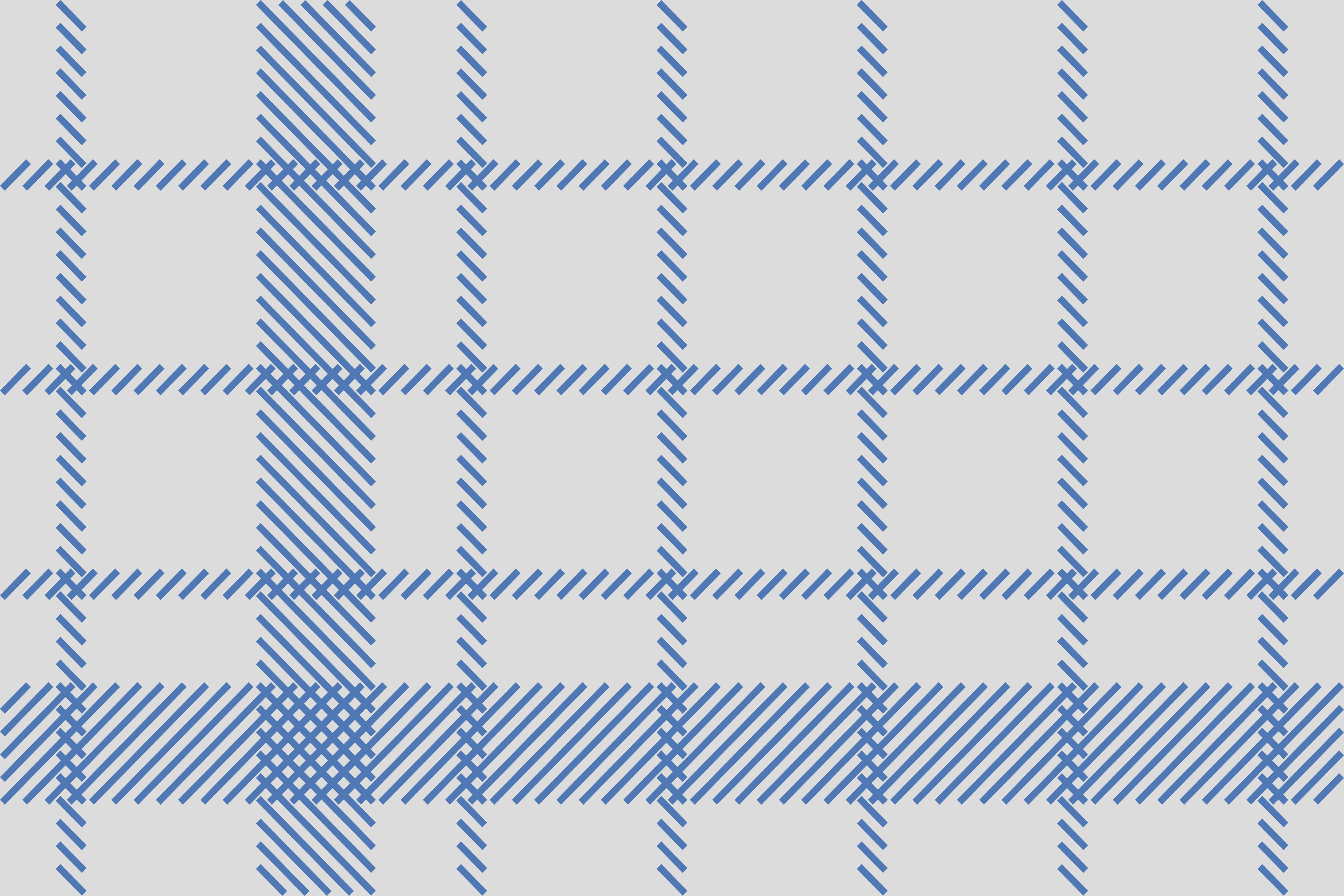
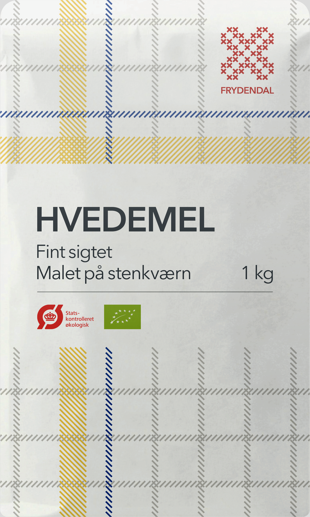
When Skærtoft Mølle launched their sub-brand Frydendal, we wanted to position the brand within Scandinavia’s gourmet ingredients. So we took our cue from the classic Nordic chef’s dishtowels. And although it is marketed as an independent label, we’re quite pleased that we were able to sneak in a tongue-in-cheek reference to Skærtoft Mølle’s mill wheel.
Done in collaboration with Claus Skytte, Stine Skytte, Hanne Risgaard, Marie-Louise Risgaard, Jørgen Bonde og Mikkel Lemvig.