
How to go local when you’re global
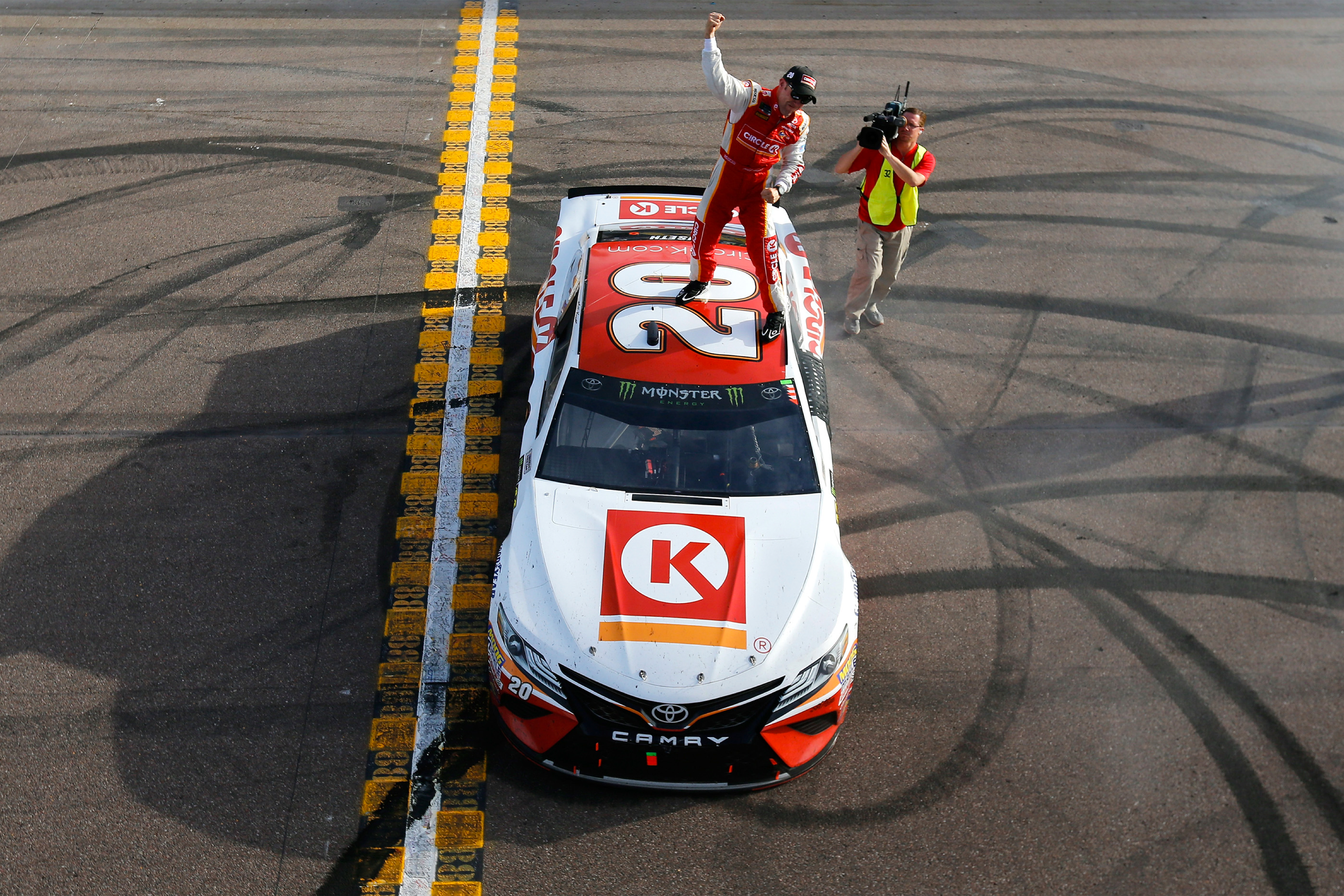
Circle K is the result of four multi-national corporations merging into a single brand.
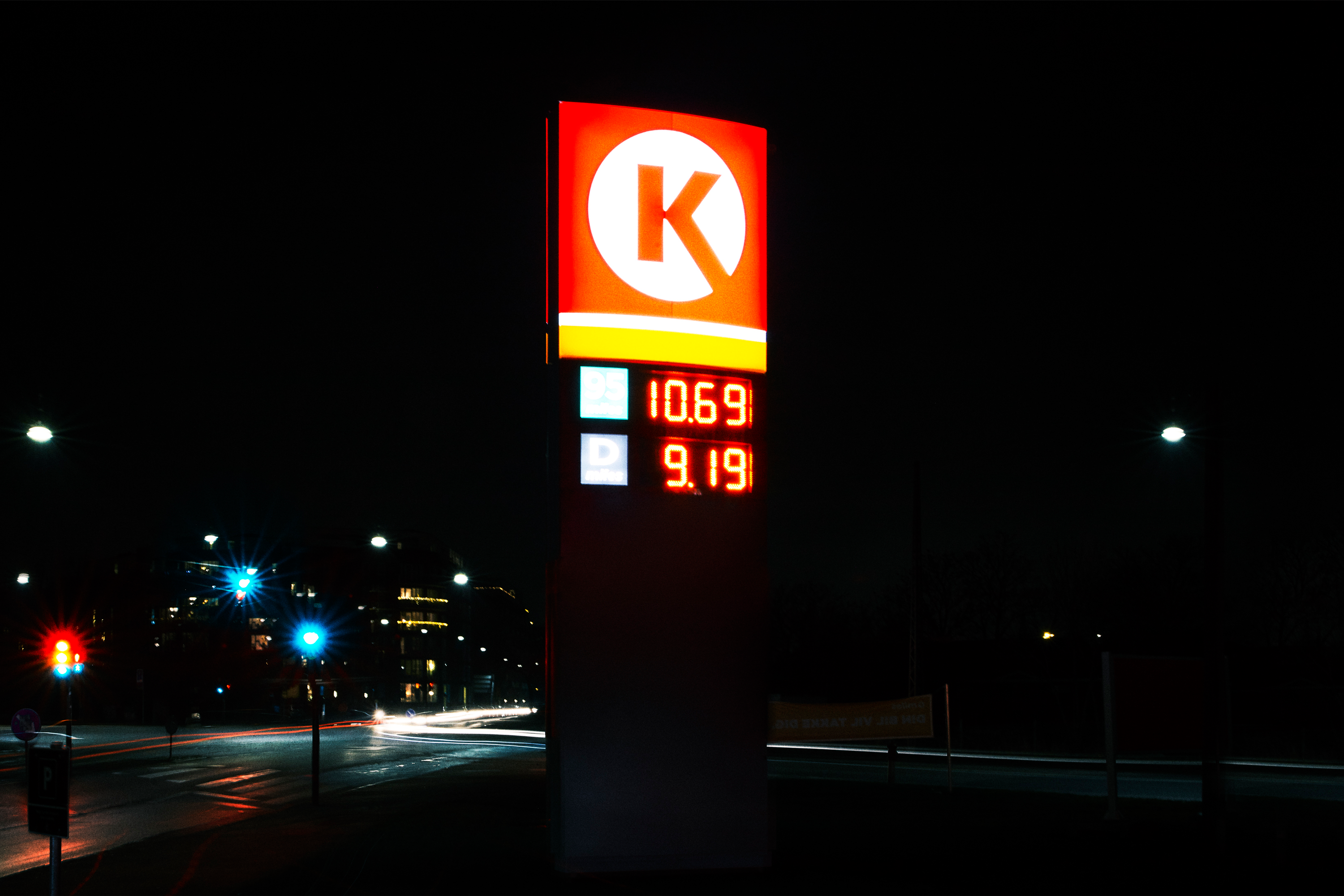
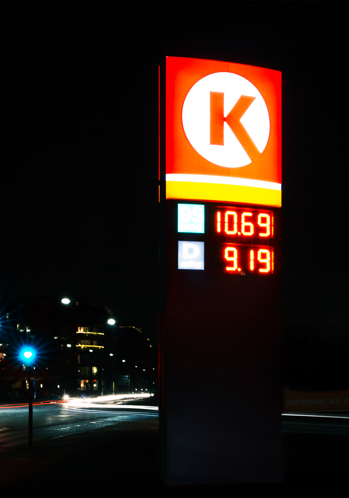
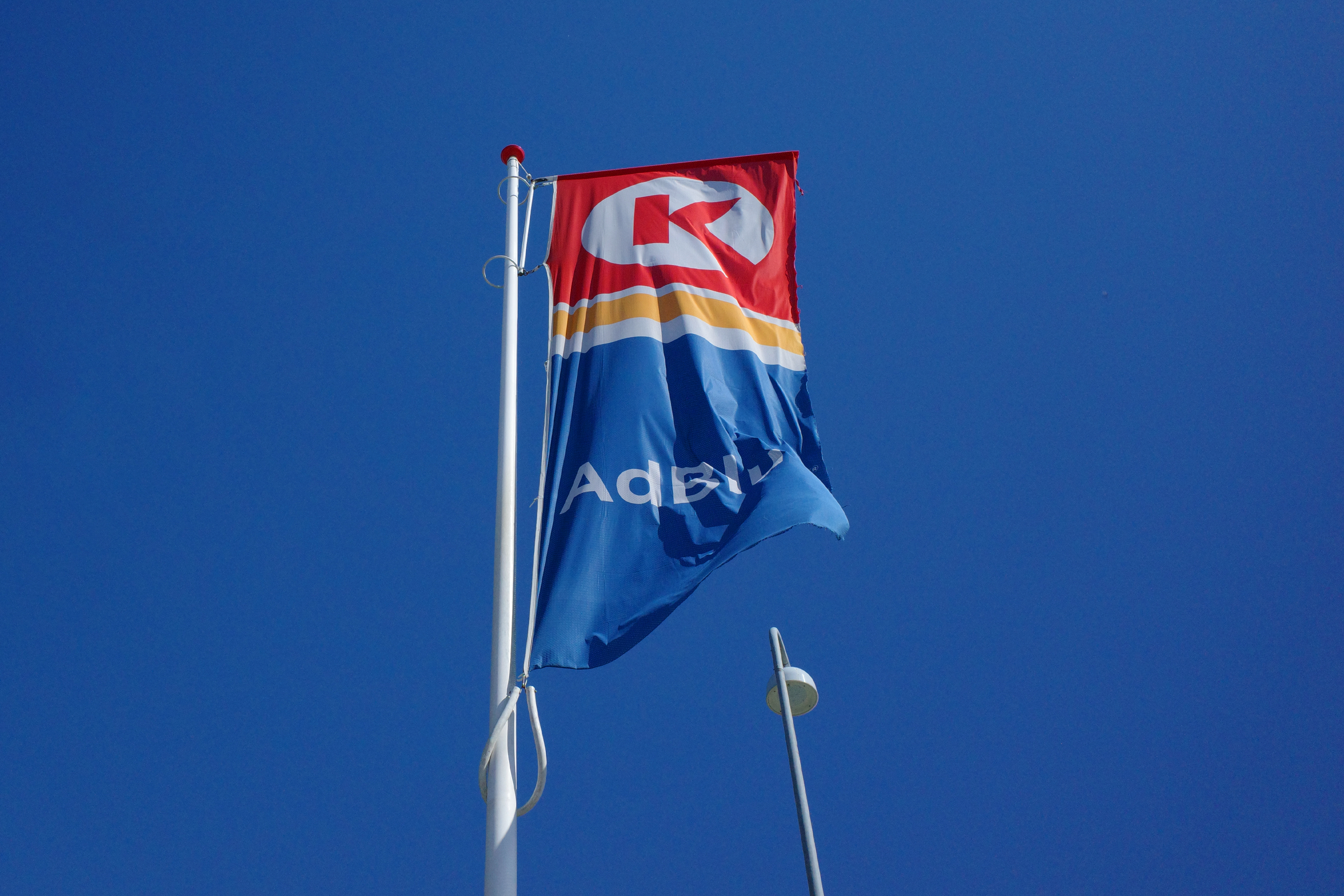
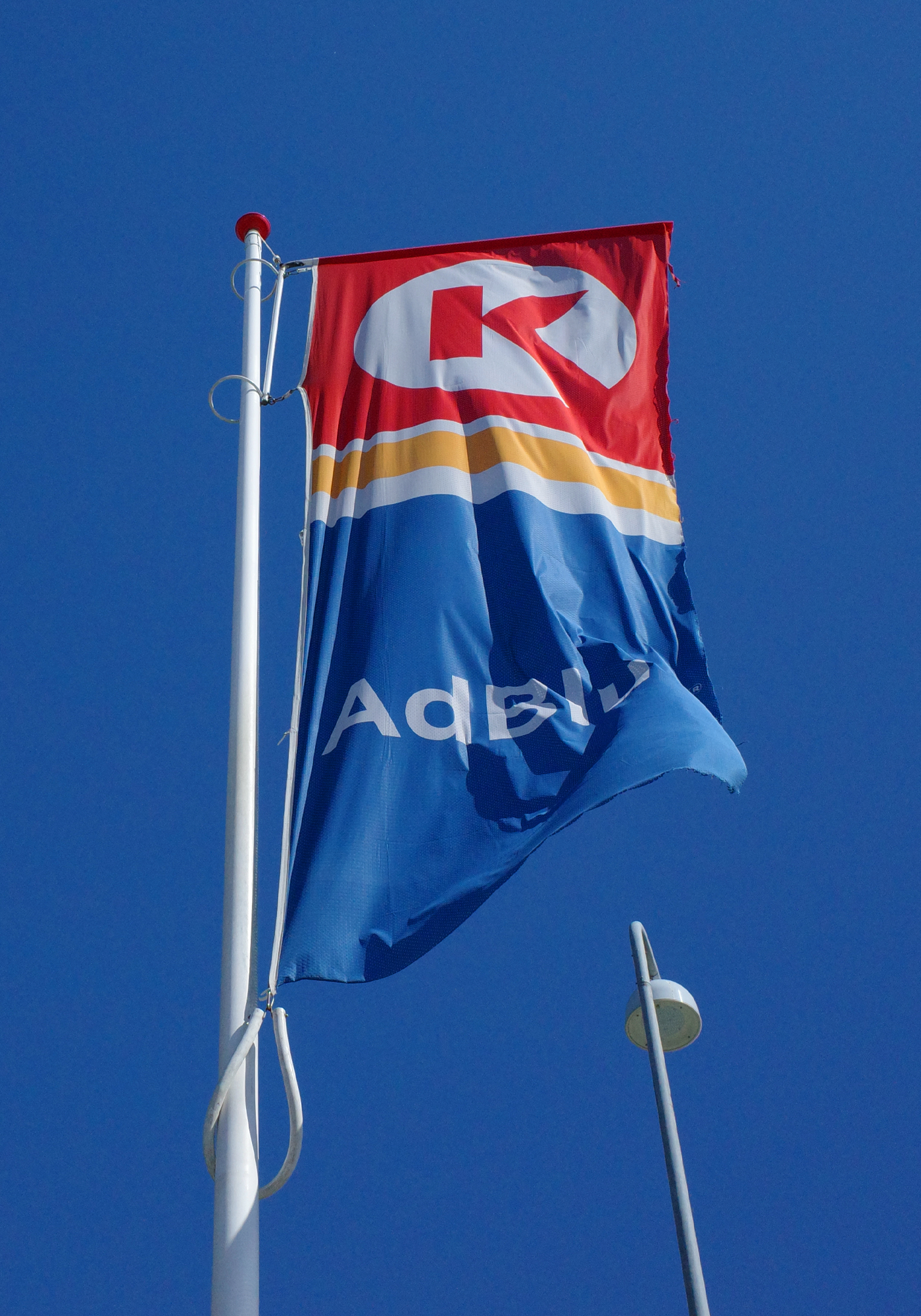
To make sure each company would take ownership of the new brand, we used colors. The orange line comes from the Statoil drop, and the red harks back to Mac’s, Kangaroo Express and the original Circle K logo.
The color scheme helps to communicate Circle K’s focus. Red, the primary color, stands for convenience — coffee, cigarettes, sandwiches, etc. — which makes up the bulk of the chain’s business. Blue, what you might call the rational color, is for fuel, windshield washer fluid and such. Finally, orange serves as a connecting color between convenience and all things car-related.