


How to conduct an identity
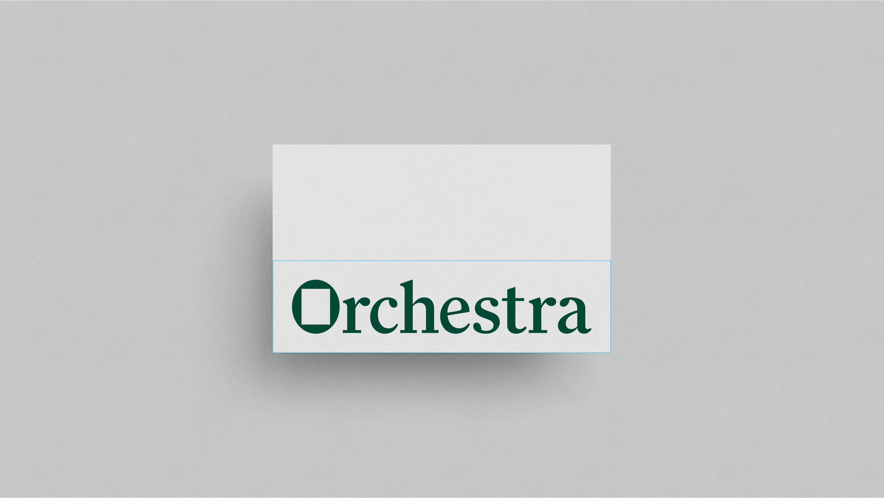
Orchestra is an independent media agency founded in 2013. To celebrate their 10th anniversary, they came to us for a visual makeover.
In an industry that has a reputation for shady dealings, Orchestra has always been clear about having their clients’ interests at heart. In fact, each year, clients receive a share of the company’s profits.
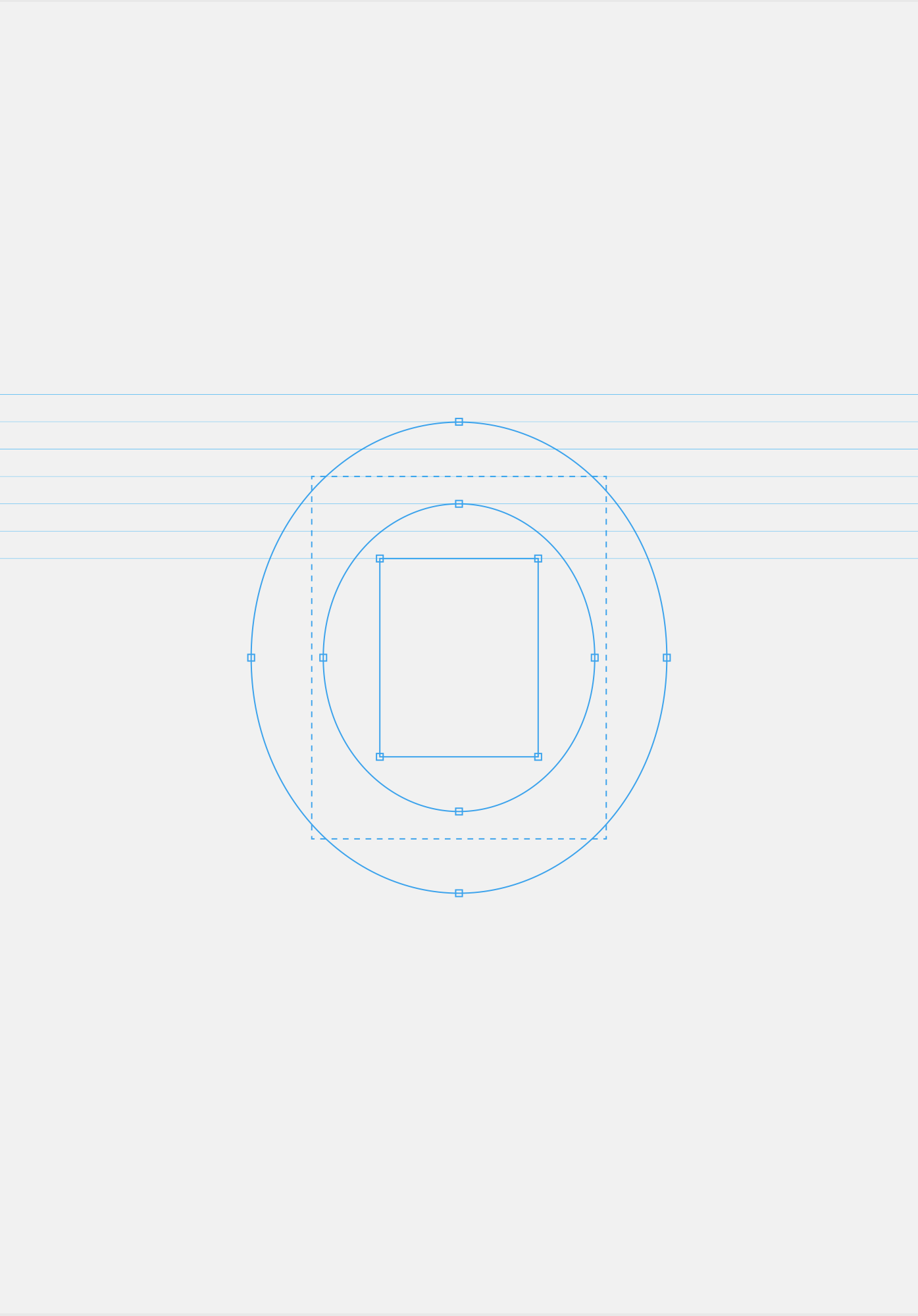
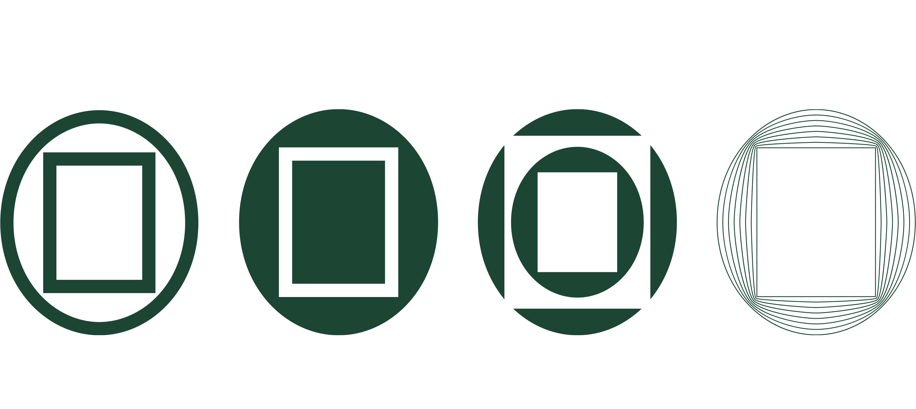
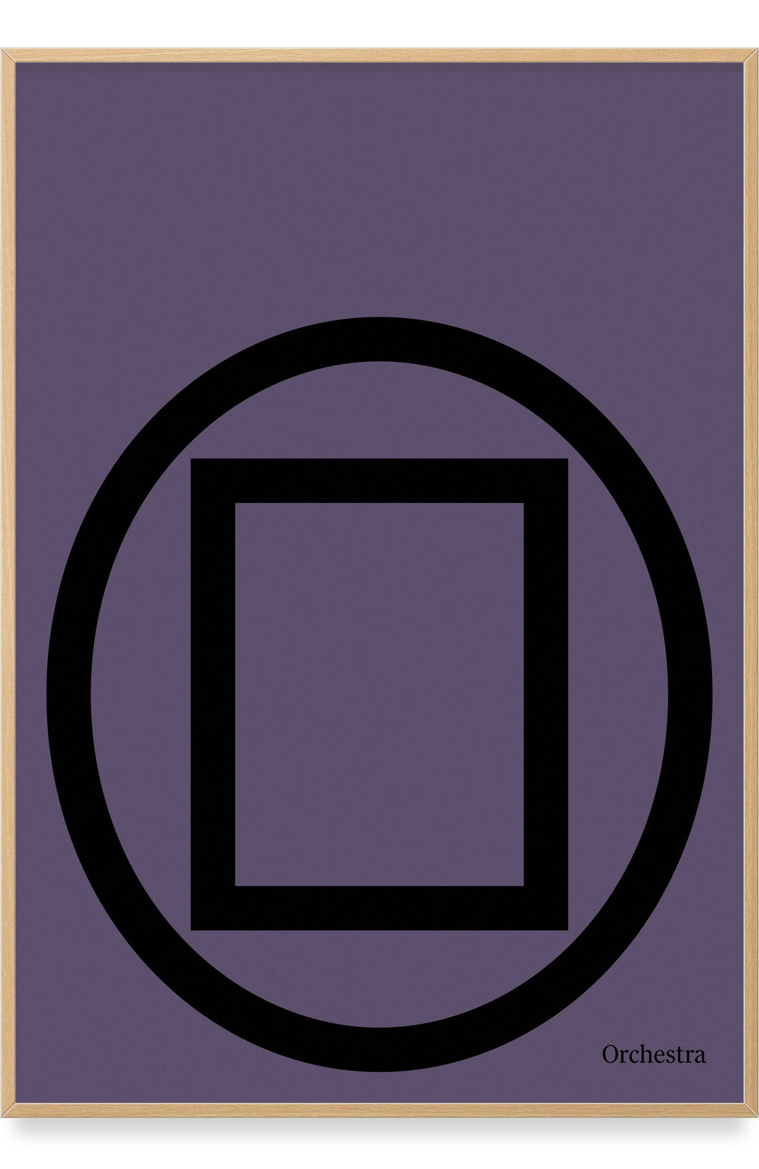
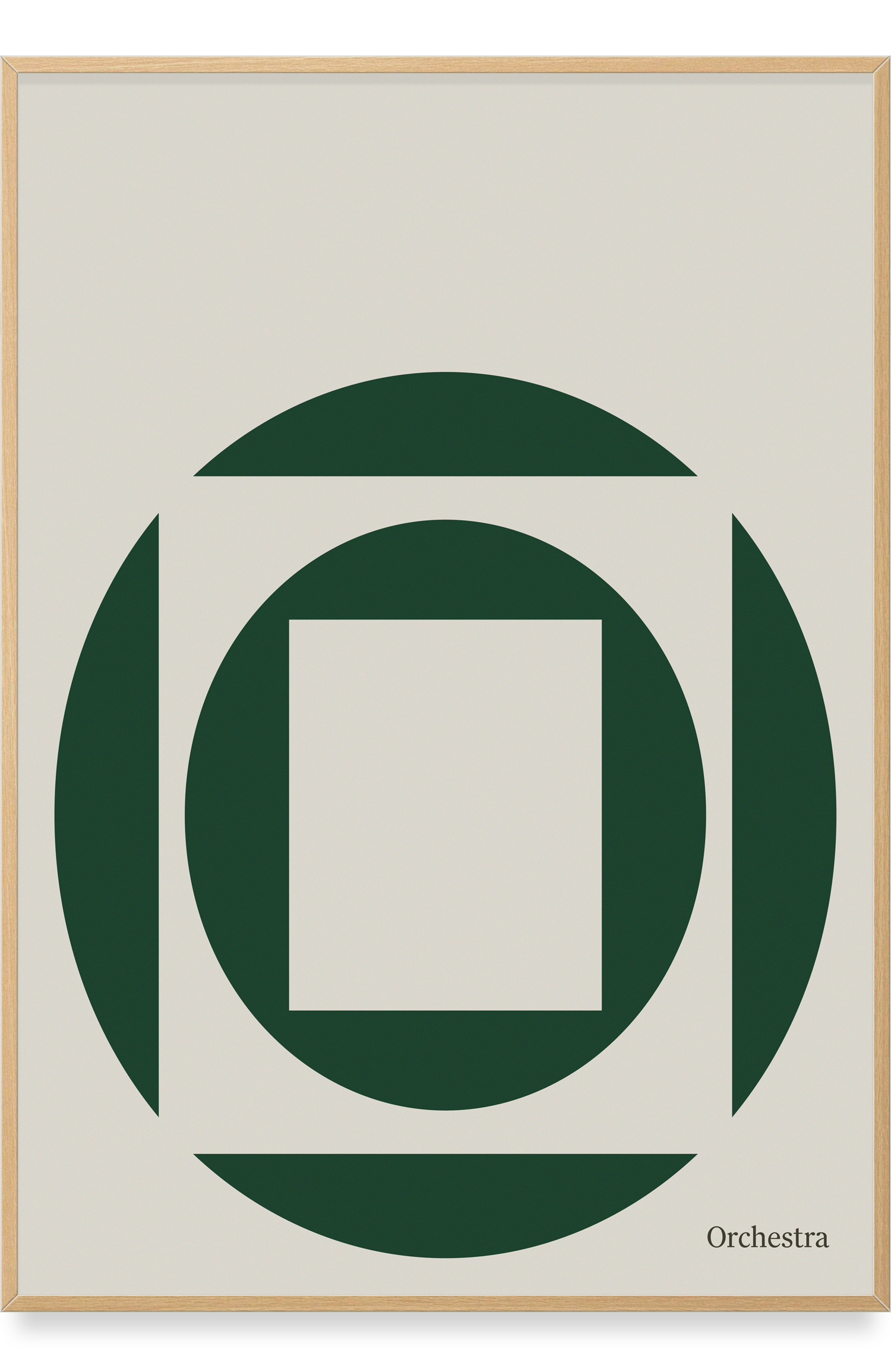
To illustrate Orchestra’s transparent, client-centric approach — and to create a visual metaphor for media placement — we used the O as a frame for a blank canvas. This simple symbol gives Orchestra countless ways of showcasing who they work for, and what they do.
When it came to color, they insisted that they were green, not corporate blue or black. So the color became ‘Copenhagen green’ — the same color as the city’s public benches — an obvious choice for a company that is housed in the heart of the city.
Done in collaboration with John Herup, Anne Stockholm, Per Knudsen, Cecilia Fahlström og Rasmus Moltke.